Knit People: Website Design
Project Overview
Knit People is a web platform that helps small-medium sized businesses manage and run their HR and payroll processes. After pivoting target markets, Knit needed a website update to better reflect this change in market and to showcase some of its newly developed features.
My Role
UX & Visual Design
Project Scope
User research, Information Architecture, Wireframing, Visual Design
Talking with Existing and Potential Users
With the new website design, we wanted to mainly target small business owners, so I decided to speak with business owners who were currently using the Knit platform, and those who would potentially use Knit in the future. These discussions helped me get a better understanding of what features small busines owners were looking for in a payroll provider.
Features most important to small business owners:
- Security (after all, Knit would handle people’s personal and banking information)
- Ease of use, set it and forget it system (small business owners have so many other pressing matters to deal with)
- Accounting expertise and legislative compliance (Lots of business owners aren’t knowledgable in accounting and the details of payroll, and their fear of the Canadian Revenue Agency and being audited and fined is real)
These three features became the key points that I structured the website around. I wanted to really stress to website visitors that Knit could provide these benefits to them.
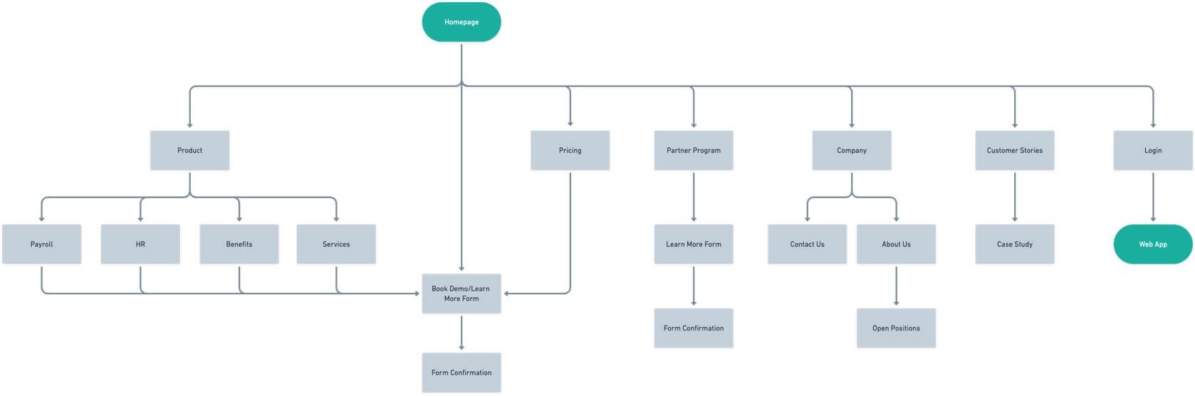
Restructuring the Sitemap
The Knit website is not complicated. It is a basic SaaS website with a homepage, product features page, pricing, and about us. And yet, the website was not optimally structured for potential customers to find the most important information. It had confusing nesting with hidden pages that could not be easily found.
I listed out all of the old webpages, as well as the new ones that were to be added, and created a simple sitemap that allowed the user easy top-bar access to all the information they needed to make a purchasing decision.
In order to assist website conversion rates, I made sure that every single page included a link to Knit's demo request/learn more form so that users could immediately book a product demo, no matter what page they were on.
Below: New and improved sitemap
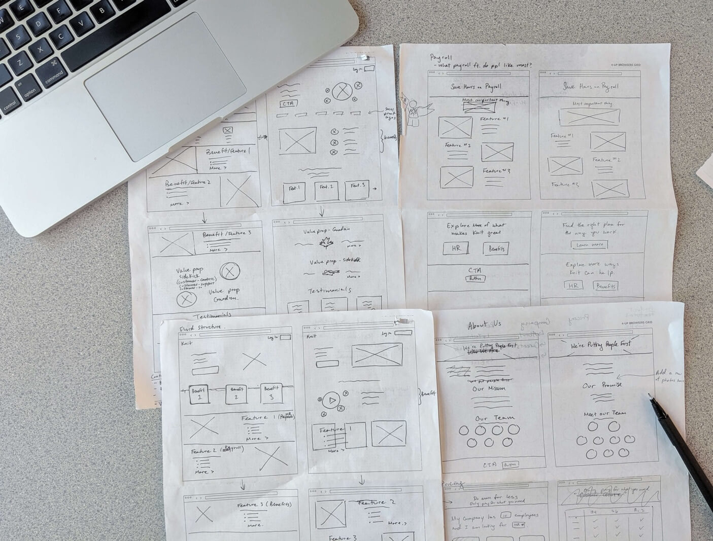
When sketching out wireframes, I worked with our marketing team to ensure that the wires captured all the information we wanted to convey to potential customers, and the brand story that Knit wanted to tell.
This is where my previous research became handy. I took the research insights and used them to help develop the content that would appear on the website homepage. The content was based off of what Knit customers were looking for in a payroll provider and what they found most valuable about Knit.
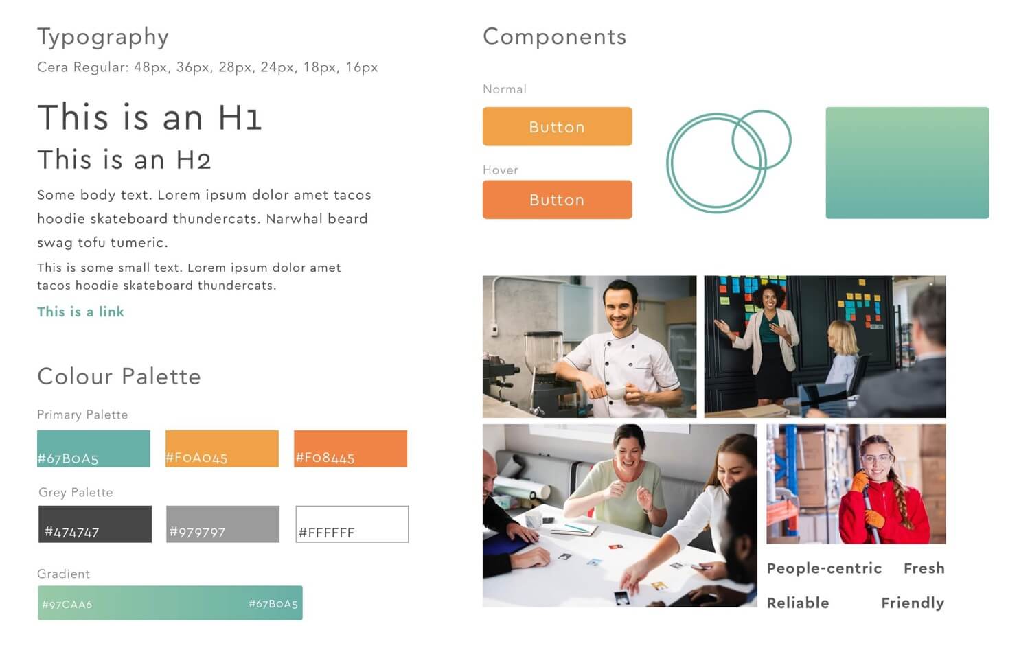
I wanted the website to be bright, light, and friendly. Accounting and payroll can be an intimidating topic that gets a bad rep for being very money-focused. So I wanted website visitors to feel welcomed with bright colours, bouncy text, and round shapes.
After looking at competitor websites, I noticed the lack of humans on their websites. This made their websites feel very stark, cold, and commerce-focused. The marketing team and I agreed that we wanted to make Knit’s payroll service people-oriented and approachable, so bright photos of friendly humans became a focal theme of the website.
Below: Style tile created to help guide the visual design of the website
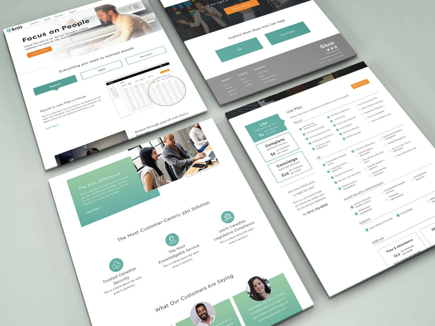
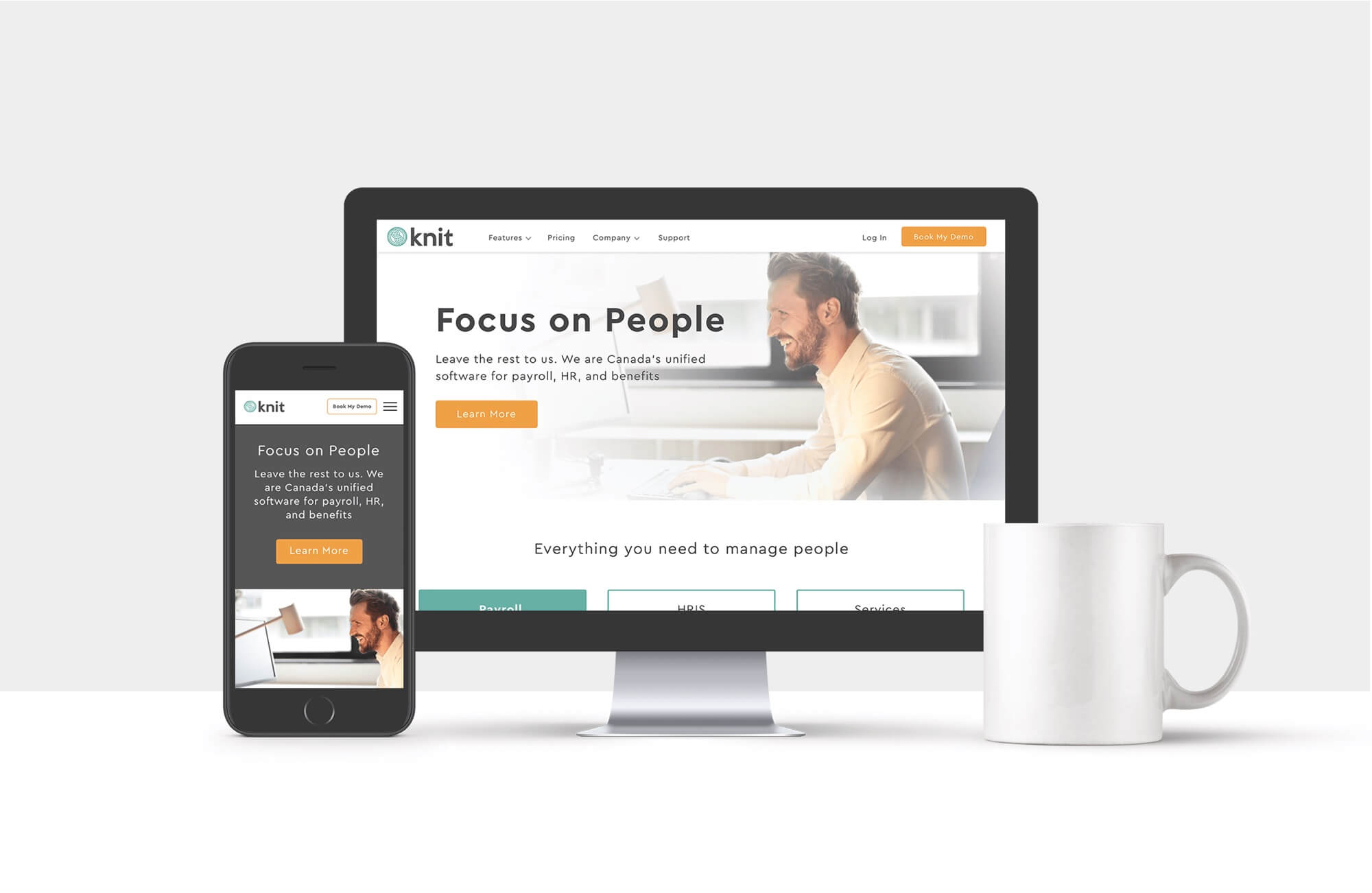
Below: Final screens