FinanceFox: App Design

An educational platform to improve your financial literacy skills, while earning rewards that will help you invest in your future.
Project Overview
As part of my UX & Product Design course at Bitmaker General Assembly, we were tasked to develop a phone app for the topic of our choosing.
My Role

UX & Visual Design

Project Scope

User research, Information Architecture, Wireframing, Visual Design

The Challenge
Millennials don't understand personal finance.
  • They find it overwhelming, scary, and insurmountable.
  • They aren't setting up the financial support systems they'll need later in life
  • This causes financial businesses and governments to lose out in the long term.
So how do you get young adults interested in finance and provide them with the necessary education in an engaging manner?
Research & User Personas
I had to understand financially illiterate millennials. What are their financial situations like? How do they feel about finance? Why haven’t they already learned about personal finance?

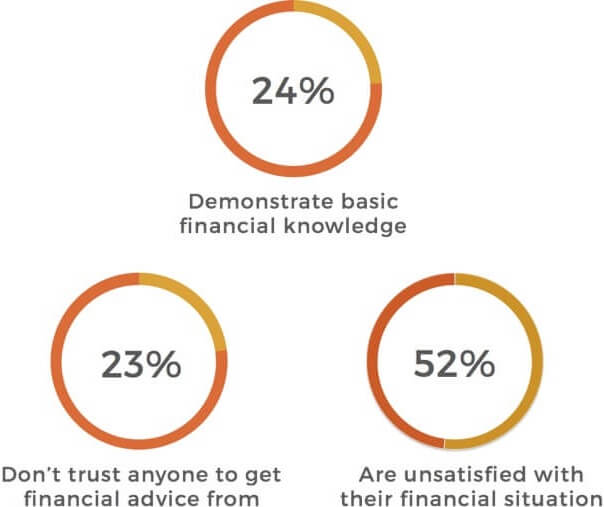
According to a study done by PWC¹:

  • Only 24% of millennials demonstrate basic financial knowledge.
  • 23% feel that they can't trust anyone to ask financial questions.
  • 52% are unsatisfied with their current financial situation.

After synthesizing user interviews, I built two main user personas and came away with a few key insights:

1

They're financially independent for the first time, and large financial decisions are becoming relevant to them.

3

They recognize that it would be beneficial to learn about personal finance, but they don't have the patience to read through long, jargon-filled finance lessons.

2

They find learning about finance difficult and overwhelming, and they don't know where to go to find comprehensive information.

Now based on my research, how might I...

Create… a comprehensive series of personal finance lessons

For… unengaged young adults

To… easily and effectively learn about personal finance matters

And improve… the overall user experience of finance lessons and increase financial literacy rates

Creating Information Architecture & User Flows
How do I organize multiple industry’s worth of information in a way that would be easy for users to navigate and make the most sense of?
Similar to a textbook, I decided to break each topic down into smaller sub-topics, which would further separate into more specific elements and the content that resides in them.
Below: A breakdown of how educational information within the app would be organized.
With the information architecture sorted out, I created user flow diagrams that illustrated how the average user would proceed through the app and complete their first finance lesson.
Wireframing & User Testing
After creating paper sketches to help visualize the basic structure of the app, and to test various layouts of information, I turned them into mid-fidelity screens for user testing.

At this point, I wrote out a sample content for one module in order to establish the tone of FinanceFox’s lessons. It was important to keep the copy and content fun, engaging, and easy to digest, as discovered through my user research.
Below: Mid-fidelity prototype with sample content to test tone and flow of the lesson.

User Testing Outcomes

After several rounds of user testing on the app prototype, I had some take-aways to muddle over:
  • The content in my session was still too long. People lost interest in reading.
  • Navigating through the session was confusing. I needed to build a better way for users to go forward (or back) through the screens with ease.
  • Users were unpleasantly surprised by the appearance of a quiz. They needed to be informed of its existence before beginning the session.
Going Hi-Fidelity
After several wireframe iterations, I moved on to hi-fi designs and conducted more user testing with the updated screens.

From the feedback that I received through user testing, the one piece of feedback that I continued to struggle with was the best way to display navigation options.

After several iterations, I tested three different navigation options with various groups of people, and the third version came out as the winner, as it was the most consistent and easiest to use.

Concept 1:
The simplest way to advance, but no good location to place the back button
Concept 3:
The Side by side buttons are easy to access and can stay consistent throughout the session.
Concept 2:
People accidentally hit the back button while trying to proceed.
A Deeper Dive Into the App: Features

Lesson Plan Creation

An important feature for my app to have was a way to serve users the lessons that were most relevant to them. This way, users wouldn't have to to scour through endless amounts of data just to find a basic lesson on budgeting.

This would decrease barriers to entry, and help users start learning quickly.

I used a topic selection page in the initial launch sequence to get a better understanding of what the user is interested in learning.
From this, the app would be able to fetch and display the most relevant lessons on the user's homepage.

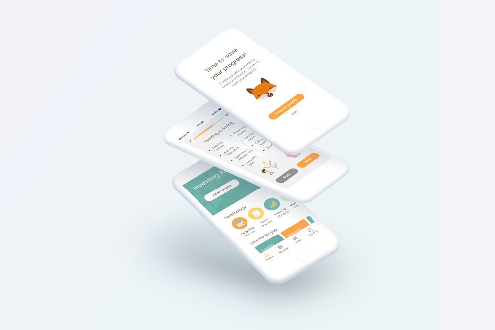
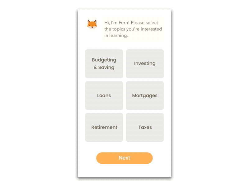
Below: New users select the topics that they are most interested in learning, and the app parses this information to display the most relevant lessons to the user.

Engage with Quizzes

To keep users engaged and to make sure that they were actually absorbing the lesson content, I decided to include quizzes throughout the modules.

Users would not be able to complete a module until they correctly answered the quiz questions.

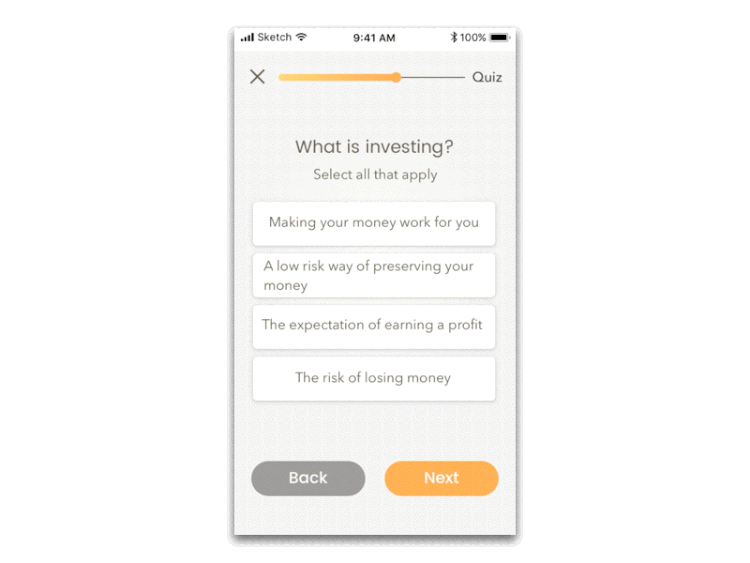
Below: Quizzes are placed throughout the lessons to keep users engage and to help them retain learned information.

A Deeper Dive Into the App: Gamification
I knew I had to add a game element into my app in order to keep users engaged and returning to learn their least favourite subject.

After talking to a finance expert, a marketer from a bank, and running through many failed ideas, the notion of offering real money incentives came up:

For every module a user completes, they earn a small amount of money. This money is deposited into their investment account that the bank of their choice would then invest for them.

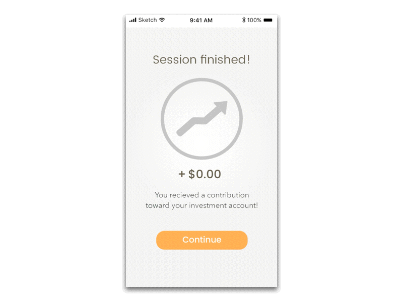
"It regularly costs mid-sized banks about $800 to acquire a new client."

- Marketing Manager from a Canadian bank

It’s a win-win for the user and for the bank.The user gains financial knowledge and gets free money to start investing, and the bank gains a new client for a fraction of the normal cost.

Below: Users earn a monetary reward for each module they successfully complete.

Visual Branding

“When I think of banks, I think of a stark office with painfully white walls, sitting across from some 55-year-old man in a dark suit who is quietly judging me.”

- Millennial from a Fast Company article ²

When creating the visual branding for FinanceFox, I wanted it to be the opposite of the above quotation.

No interrogation room white walls, no stiff man in a suit, and definitely no judging.

FinanceFox had to be fun, light-hearted, and colourful.

I steered away from the traditional finance colours of green or blue and chose teal and orange as my main app colours. Teal keeps things fresh while still mixing the calming properties of green and blue, and orange makes things energetic and bright.

I also wanted the shapes and illustrations in the app to be fun and cartoonish.

FinanceFox needed to be welcoming and something you could smile at while learning about a vitally important, but not exactly the most engaging subject.

Reflections & Key Takeaways
Brainstorm until you can't brainstorm anymore

... and then get feedback.  

Through the course of this project, I found that the first idea I put on paper was never, ever, the best one. It usually took me multiple attempts at an idea before I landed on a few that I thought were appropriate. Once I reached brain fart, I found that the best way to narrow down all my ideas and settle on one was to seek feedback from my mentors and peers.

Not everyone thinks in the same way

Just because something made perfect sense to me, it didn't mean that other people understood it in the same way. That's why testing, seeking feedback, and the ability to accept criticism and change course became so vital for my project.

Testing is useless unless there is a goal in mind

I realized that I can't just throw my screens at people and ask "what do you think?" That usually lead to responses along the lines of "it's cool", or "I like it". I needed to guide my testers and ask more pointed questions in order to get valuable feedback.

References & Attribution

¹ PWC (2014). Millennials and Financial Literacy. https://www.pwc.com/us/en/about-us/corporate-responsibility/assets/pwc-millennials-and-financial-literacy.pdf

² Elizabeth Segran (2015, January 22). Where Millennials Learn About Money Over Plates of Chocolate Mousse With Ginger Cream. https://www.fastcompany.com/
3041209/design-stars-ideo-and-a-pack-of-millennials-walk-into-a-coffee-bar

Select illustrations Designed by Freepik